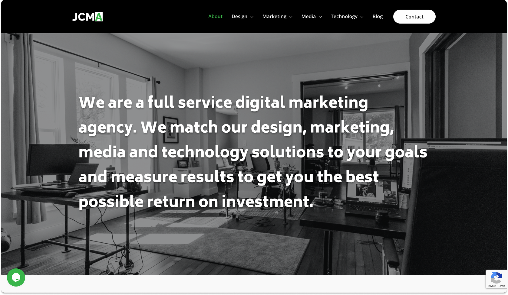
WordPress website that delivers an overhaul of typography and information architecture for a marketing and technology agency


JCMA Inc. is a small digital marketing agency who offer print and digital design, IT consulting, and media content production services. Hosting a number of clients across Indiana and the country, this scrappy startup hired me as their first UX designer. I spearheaded the redesign of our agency website by incorporating a branching navigational structure, updated typography styles, informative content layouts, and a new build format.
In order to design a prototype that was substantial and resolute, we surveyed the current landscape and measured what other competitors were practicing within their mobile tracking apps. In doing so, we created an understanding of which design methods were effective, useful, pleasing, and intuitive.

JCMA offers a range of services through different departments in the agency. I simplified the language around each title, suggested defining iconographic elements, and expressed the clickable elements as UI cards on the live site. This process helps customers connect with the service they need immediately from the website's home page.

I identified a trend being utilized by analogous companies across the industry. This inspiration pushed me to design a core statement somewhere on the site that defines our agency's efforts in a concise yet comprehensive sentence. Our updated, bolder font also takes advantage of this opportunity to carry some interesting typographic weight as a bolder, larger, and longer string of text.

Prior to my rebuilding the agency's website, there was not a great mobile experience. Content overflowed containers in unexpected and jarring ways. Sections did not resize properly. And interaction via thumbs wasn't overly considered. I championed a minimal, usable, and clean UI approach when tackling the visual redesign in Figma.

Another industry practice that considerably resonates with me is the design of a section that highlights where a company has been and with whom they have worked. The component is a great confidence builder for an agency as well as trust builder for prospective clients. Potential customers gain a greater sense of a company's track record if they see evidence of prior and existing, successful business relationships for a marketing agency. JCMA holds a strong footing in Northern Indiana with small and medium-sized businesses.

Work samples and design highlights in context as a presentation format were considerably lacking in the older iteration of JCMA's website. I set out to design sections on the new website that prominently display different print and digital work that our agency has delivered. Customers need to see these items in direct, high-res, and large formats to understand what they're buying, but also to start building the vision of what their business could become.

